Prim & Improper
The pinnacle of “sophistication”.
Client
Prim & Improper
Services
Branding
Role
Creative Direction
Graphic Design
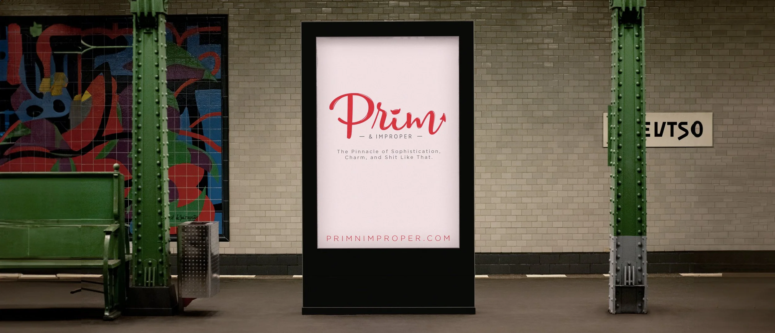
A sassy southern woman needed a logo for her blog, and that kinda thing fits right in my wheelhouse. It needed to be on-trend, it needed to be bright and eye-catching, but it also needed to be unique.
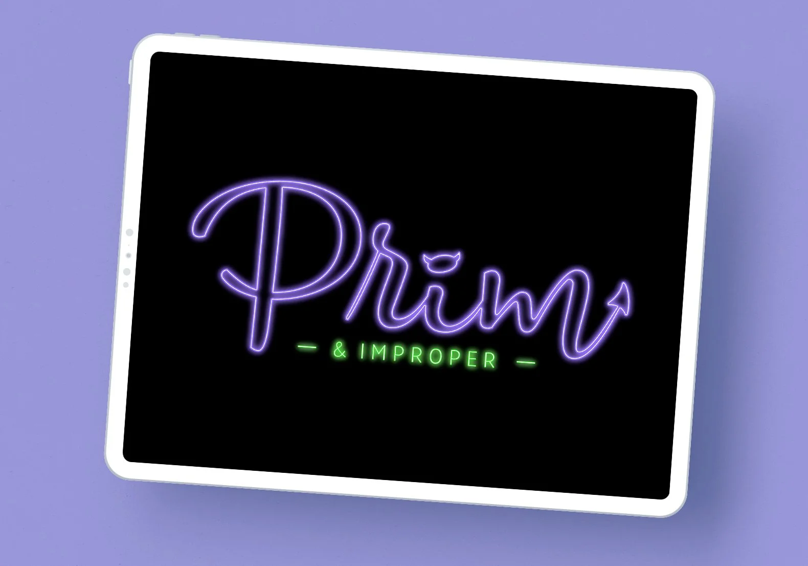
The font choices made sure it felt current, the horns and tail gave it a kick of personality, and a few color/style variants sealed the deal. The result is a logo wholly catered to the brand that can adapt to any and all media.
Head over to primnimproper.com to learn more.
This wordmark is a great example of how to look to part while standing out from the crowd. The “script font + sans serif” style is trendy, but it’s so ubiquitous that you could buy a $5 template and be done in 90 seconds. Subtle details can take a something like this from basic to stylish, unique, and keep your from getting lost in the trend.


